How to design DOOH creative for real places
Good DOOH creative starts with the room, road, store, or vehicle where it will appear. Here is a practical venue-first design process.
The best way to review a DOOH ad is not from six inches away on a laptop.
Put it at roughly the size it will appear. Step back. Walk past it. If it is a restaurant screen, imagine a lunch line moving under it while staff call out orders.
That is where the creative has to work.
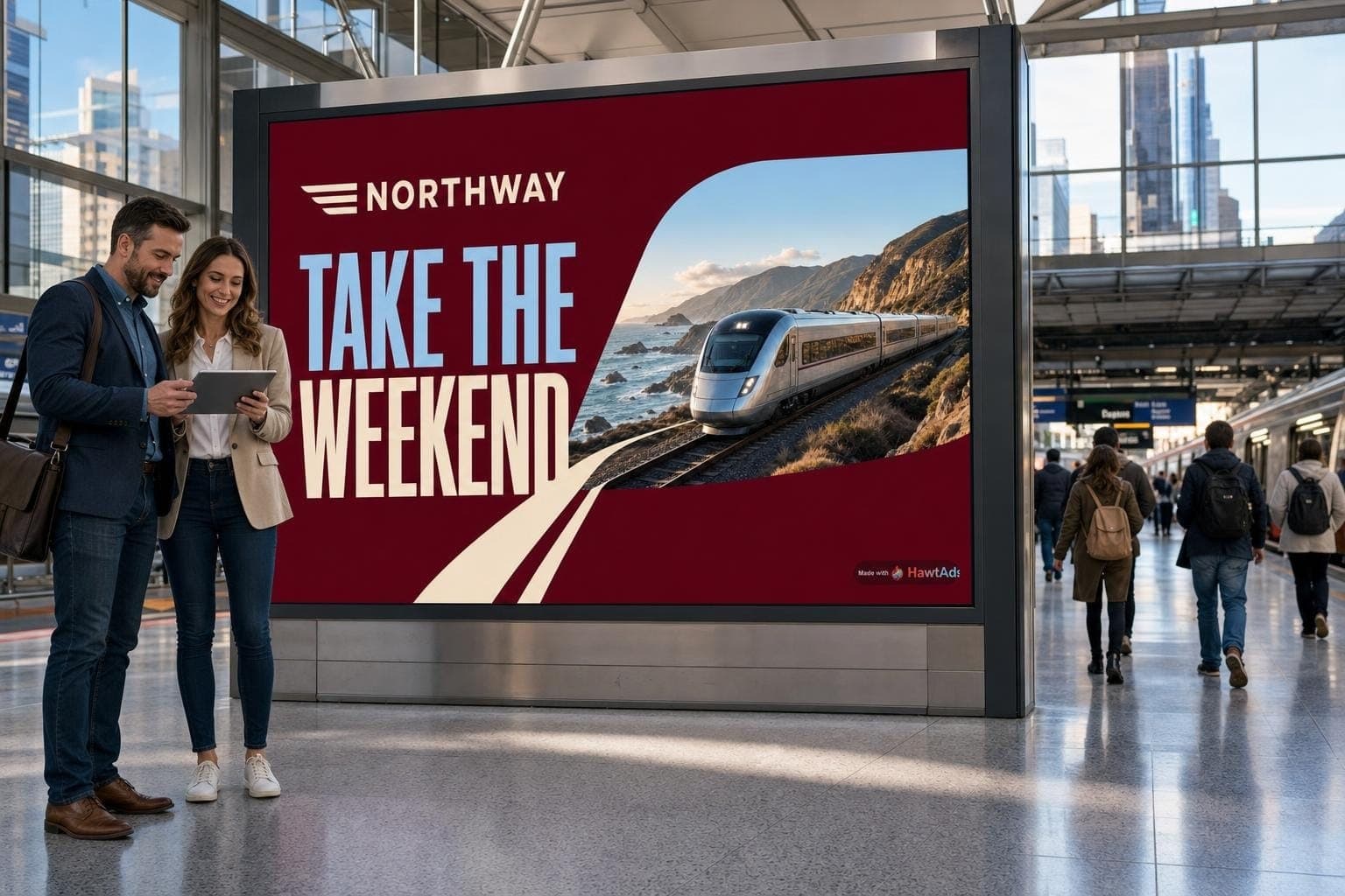
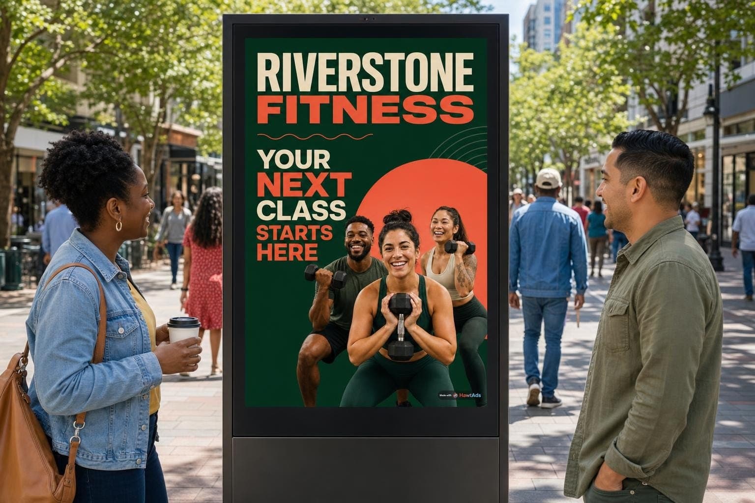
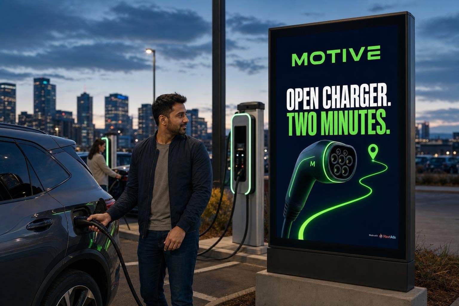
Digital out-of-home is a collection of very different viewing situations. A roadside billboard, an airport panel, a grocery display, a restaurant menu screen, and a rideshare tablet may accept the same file type. They should not receive the same design.
This guide is part ten of our DOOH series. If you are still deciding whether the channel fits your team, start with the programmatic DOOH readiness checklist.
Begin with a venue brief
Most creative briefs describe the audience and campaign. A DOOH brief also needs to describe the physical encounter.
Before opening a design file, answer these questions:
- Where is the screen mounted?
- How far away will most viewers be?
- Are they walking, driving, waiting, shopping, or seated?
- How many seconds are realistically available?
- Is the screen competing with menus, signs, windows, or other screens?
- What are the light and sound conditions?
- Can a person safely and comfortably act on the message there?
The answers change the ad. Someone waiting at an airport gate can read more than someone passing a street panel. A passenger in the back of a rideshare can see a smaller call to action than a driver moving past a board. A restaurant customer may already be deciding what to order, which makes availability and speed more useful than a broad brand promise.
Give the ad one job
Putting every campaign point into the ad quickly creates clutter. A QR code competes with a URL, a price, and four product shots. Everything is present, but nothing is easy to grasp.
Choose one job for the ad. Introduce the new item. Make the store easy to find. Put one product at the top of the shopping list. Remind commuters that a service exists. Give a waiting traveler one useful offer.
OAAA's creative primer calls simplicity a fundamental principle and recommends large, legible type with enough spacing to survive variable viewing distances. (OAAA Creative Primer)
A simple hierarchy usually works:
- One thing to notice
- One thing to understand
- One thing to remember or do
Branding belongs in that hierarchy. It should be recognizable without pushing the actual message into fine print.
Design from viewing distance, not pixel dimensions
A 1920 by 1080 canvas can describe a conference room display or a huge LED wall. Pixel dimensions alone tell you almost nothing about readable type.
OAAA's planning guide ties minimum readable text height to distance and notes that contrast and background complexity also affect legibility. (OAAA Planning for OOH Media) Use the media owner's specification as the production floor, then test against the actual viewing distance.
A quick, low-cost test works well:
- Show the ad full screen on a monitor or television.
- Stand at a scaled viewing distance.
- Look for only two seconds.
- Write down what you remember.
- Repeat with someone who did not work on the campaign.
If the person remembers the background decoration but not the brand or offer, revise the hierarchy. If the disclaimer cannot be read, making the file sharper will not fix it.
Respect the screen edges
Screen networks include many aspect ratios, players, and display configurations. A file may be cropped slightly to fit a nearby ratio.
Broadsign recommends keeping logos and text away from the edges, with about a 5 percent safe margin on each side. It also recommends supplying creative compatible with the language and resolution of the targeted screens. Otherwise an eligible line item may have no compatible ad to play. (Broadsign creative guidance)
Build a safe area into the design system. Keep critical copy, prices, disclaimers, and logos inside it. Background color and nonessential photography can reach the edge.
When one campaign spans tall kiosks, landscape panels, square retail screens, and unusual spectaculars, do not solve the problem by shrinking one layout into every shape. Create a composition family. Lock the campaign idea and essential assets, then let the layout respond to the format.
The HawtAds Ads Engine is built for this kind of bounded adaptation. It can use the screen and permitted context to decide the message, visual angle, copy, and layout while preserving the pieces the brand has locked.
Assume the video is silent
Many public DOOH placements do not play audio. Broadsign's documentation tells buyers not to rely on sound for video creative. (Broadsign)
Watch the spot muted. The first frame should make sense, the product should not disappear for most of the slot, and the ending should stay up long enough to read. Captions can help when speech is necessary, but a miniature subtitle block is not a substitute for visual storytelling.
Motion should direct attention. A product entering frame, a number changing, or a simple transition can add energy. Several simultaneous movements can make the important one harder to find.
Let the venue change the message
Venue-first design is not only about type size. Place can change what is useful to say.
Take a restaurant screen at lunch. “Green Goddess Bowl” and “Ready now” answer a decision the customer is already making. In the morning, the same screen might prioritize coffee and a breakfast sandwich. On a cold evening, it might feature soup. If an item sells out, the ad should stop promising it.
This is where context becomes operational. The input needs a known source, an update schedule, an owner, and a fallback. “Ready now” should come from current availability, not a hopeful spreadsheet.
The HawtAds Ads Engine connects those permitted signals to the creative decision. A restaurant can keep its logo, product photography, claims, and price rules fixed while allowing the offer and composition to fit the hour, screen, and available menu.
The same reasoning travels to other venues:
| Venue | Viewer reality | Creative response |
|---|---|---|
| Roadside | Moving, distant, very short glance | Few words, large type, one strong shape |
| Airport gate | Waiting, more dwell time, travel context | Useful detail, clear sequence, destination-aware message |
| Grocery aisle | Close range, active shopping task | Product recognition, shelf relevance, simple action |
| Rideshare | Seated, private or small-group view, often silent | Close-range layout, longer story, privacy-aware context |
| Restaurant counter | Decision in progress, busy visual field | Immediate item, price or availability, strong contrast |
Make the creative complete without a click
Most DOOH is not clickable. Broadsign advises that the creative should communicate its main message without requiring a website visit to understand it. (Broadsign)
That does not ban URLs or QR codes. It means the ad should deliver value before someone reaches for a phone.
Use a QR code only when the viewing situation supports it. A stationary customer in a lobby may have time. A driver does not. If you use one, keep it visible long enough and give it a clear reason to scan. OAAA's QR guidance notes that many OOH ads appear for 15 seconds or less and recommends showing the code for the full slot. (OAAA QR code design guidance)
Review the ad in context and in failure
Do not approve only the best-looking frame. Review every state the system can serve.
Check the longest headline, widest price, missing image, unavailable feed, fallback creative, light and dark conditions, unusual screen ratio, and the transition between ads. Confirm that legal copy stays readable and that a late data update cannot create a false claim.
Automated creative also needs human accountability. OAAA recommends human approval for digital display content, noting that programmatic and automated sources can increase the risk of inappropriate material. (OAAA) Your workflow can be fast without making it ownerless.
A ten-minute preflight
Before sending files or turning on generation, ask:
- Can a new viewer understand the ad in the available time?
- Are the brand and main message obvious?
- Is every critical element inside the safe area?
- Does it work without sound?
- Is the smallest required text readable from the real distance?
- Is every product, price, and claim tied to an approved source?
- Are all targeted dimensions covered?
- Does each contextual input have a fallback?
- Has someone reviewed every allowed state?
Good DOOH creative does not begin with a trick. It begins with the placement, the viewing conditions, and an action the audience can realistically take.
Use the venue brief to set the boundaries, then let the HawtAds Ads Engine create the version that fits the screen and moment. The final article in this series explains how to evaluate a DOOH platform around the work your team actually needs to do. When the screen version is ready, try HawtAds to reshape the idea for social feeds, display banners, and app-store campaigns.
Quick answers
How many words should a DOOH ad use?
There is no universal count. Use only what a viewer can grasp at the placement's real distance and dwell time. A roadside board usually needs far less copy than an airport or rideshare screen.
Can I reuse social creative for DOOH?
You can reuse the idea and approved assets. Rebuild the composition for the screen ratio, viewing distance, safe area, sound setting, and time available rather than relying on a simple resize.
When should a DOOH ad use motion?
Use motion when it clarifies sequence, directs attention, or shows a useful change. Keep the main product, brand, and action readable without audio, including for viewers who enter halfway through the slot.